All the charts and data we refer to can be found on the Yacht Club page.
Hey everyone,
For the last couple of weeks, we've been talking about how you don't
need to trade the index. Indeed,
"you don't have to hold, or act on, a strong opinion" at all. These macro-geopolitical conundrums, as with Iran and Hormuz,
beg you to have strong opinions about their outcomes—but you simply don't have to listen.
Instead, we encouraged taking bets in smaller markets, and in uncool places with more edge, and ideally while using methods that generate trade ideas for you (so you avoid injecting your opinions). It just seems like a particularly good time for that.
Simply put, we felt that it was
not a good time to take big stupid bets in big stupid markets, because even though the index has looked
tired for the past month—at the same time, the only position that sort of made sense based on the data is a long OTM call (bought perhaps cynically, and perhaps while sneering).
However, after a bit of extra downside this past week, we'd like to start thinking about analogs. Historical analogs. Not from the perspective of the gigabrain macro analyst (i.e., not whether the supply-demand curve of oil suggests that oil futures stay under $120 even if spot markets move higher and not whether Donald Trump's ultimate purpose in attacking Iran was as a bartering chip with China and not even whether the nascent correlation between crude and risk assets will persist), but rather, we just want to see what the S&P 500 has done in the past when it's wiggled like this.
But first...
- Under Review
- Unfinished Business
- Hello Darkness My Old Friend
Under Review
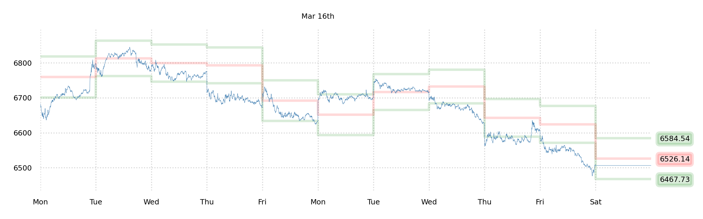
Nearly 2.00% of downside on the week. Calm action. Our only position was a long OTM call way up at 7000 SPX—which is now a whopping five hundred points out of the money.
(
Last weekend, we made a big point about how buying a cheap OTM call in this kind of environment isn't the kind of thing we end up regretting, even though it's not likely to pay. Well, it
didn't pay; and we
don't regret it.)
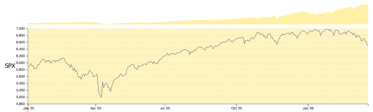
Since this is one of those situations where the two-week chart doesn't quite provide enough context, let's pull up a longer history (15 month):
This is a really interesting chart. If you had to frame it and hang it on the wall, you'd probably call it something like...
- Under Review,
- Unfinished Business, or
- Hello Darkness My Old Friend.
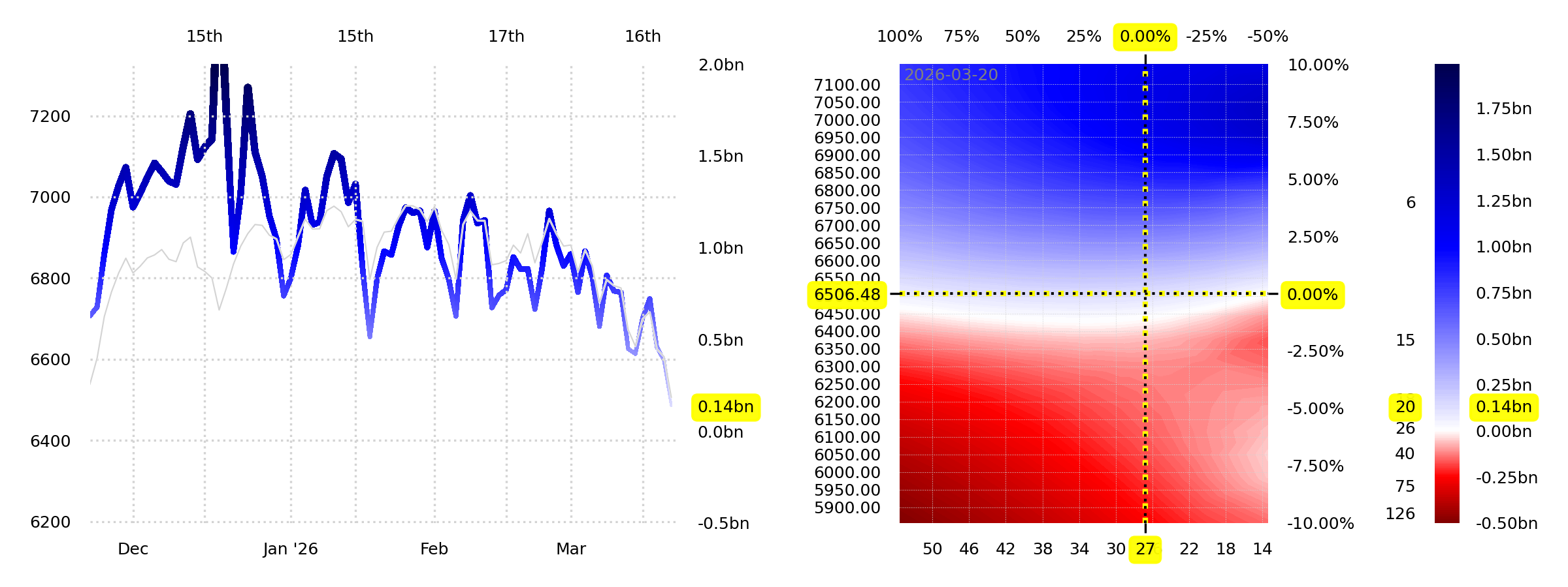
It speaks of unresolved tension. And as if to add to that visible tension, we have a colorful picture of what's underneath the surface:
Dealer gamma is approximately neutral here, and should begin to turn negative about 100 points lower. While this is interesting in its own right, and certainly encourages higher absolute levels of volatility—does it encourage us to do anything differently?
Unfinished Business
No, not really, because the market is pricing vol just high enough that there's no obvious trade—aside from what we'd been doing already.
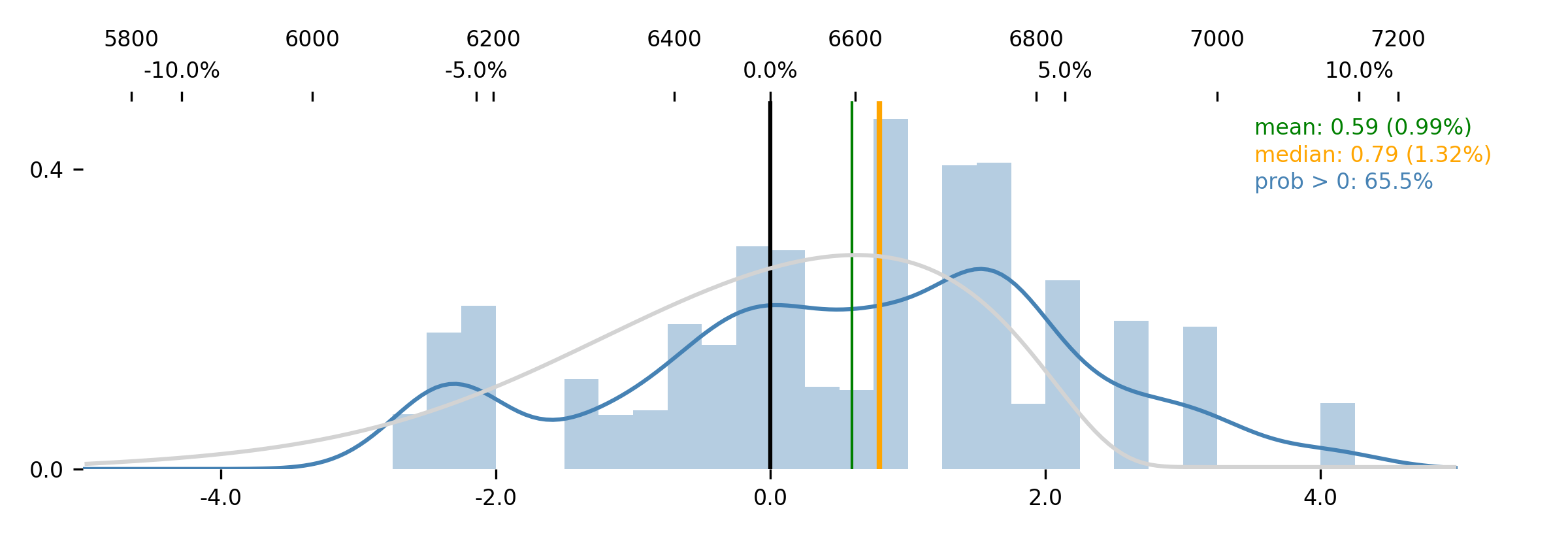
As GEX fell, SPX vol rose in-kind, and the relative differences between the market-implied probability density (gray) and Jim's forecast (blue) are pretty much exactly what they were before. A weekly move of 2.50% might now be considered "average," but the relative advantage of any given strategy appears unchanged.
The only virtuous position appears to be the long OTM call—a fixed-risk bet on a rebound. A noncommittal punt to benefit from a hated countertrend rally.
That's it. That's all that's on offer right now in the S&P 500.
But since we still want to understand better what's going on, let's try to dredge up a bit more context.
Hello Darkness My Old Friend
A 2.50% move would be easy this coming week. A 5.00% move would be perfectly reasonable. This is the kind of week where we'd like to have a sense of place, so that we can adjust to a fast-changing environment.
And so, consulting the interactive
S&P 500 Chart, we ask the question: What is the current market
most similar to in recent history?
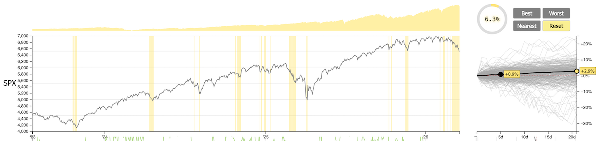
Click the "Nearest" button four times and you've reduced the data to the nearest 6.3% of history.
These highlighted periods were most similar to the current combination of SPX price-trend, SPX vol-trend, DIX, GEX+, RISC, VIBE, and VIX. Price-trend (P)Ω meaningfully down, vol-trend (V) is gently up, DIX is steady around 45, GEX+ is nearing zero, RISC is low, VIBE is slightly negative, and VIX is somewhere above 25.
The sampled periods are always followed by support, oftentimes a rally. When we zoom in even more (nearest 0.4% or 0.2%!), the only highlighted periods in the whole dataset are May/June 2006, mid-January 2008, August 2014, and March of 2025.
This is... pretty fascinating. May/June of 2006 was a period of commodity-induced inflationary pressure inducing a global selloff (sounds familiar!). The January 2008 highlight is literally the day that the Fed did an emergency 75bps rate cut after banks starting writing down mortgage losses. The August 2014 highlight (we remember this one better) seems to be when we had broad "Eurozone growth fears" coupled with the Russian Crimea annexation in its war with Ukraine. Then, lastly, the March of 2025 highlight was Trump's tariff war (hilarious that this shows up!).
Across more than twenty years of sampling for those situations nearest the current data setup, we find a mix of commodities rallying, inflation fears, Fed emergency cuts, and moments of geopolitical turmoil. And if we had to characterize what we see in those histories, it would be...
This is the bottom... for maybe a couple weeks.
Perhaps this is a triumph for our pattern-matching brains, that we already saw "unresolved tension" in the plot of the S&P 500. That this is not really a dip to buy sincerely, nor a trend to follow, but rather, a moment for a temporary stability.
Of course we could be wrong. This could be different. Et cetera.
But there's a pattern, and that's going to be our reference for now.
There. That's enough words for this situation.
Enjoy the week!
The SqueezeMetrics Team