All the charts and data we refer to can be found on the Yacht Club page.
Hey everyone,
Let's talk more about hunting for signal in SPX correlations.
But first...
- Default-mode
- Shrugging
- Delta-fudging
Default-mode
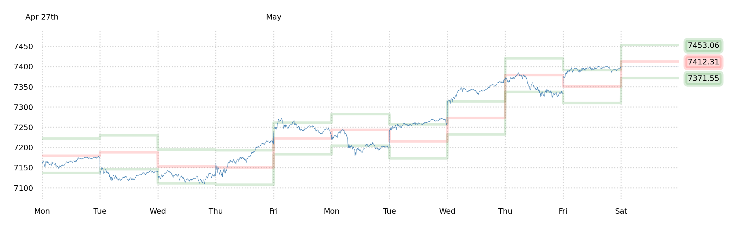
Apart from the occasional whining about our puts decaying, we spent most of the week noticing that the price-action was extremely obedient to the Support, Momentum, and Mid bands.
We usually call this a "default-mode" market, and it usually implies that there's just not a lot going on under the surface.
This might seem a bit crazy right now, given that the index just went straight up since the end of March in the most relentless rally we've ever witnessed—but it appears from the price-action that the market is more or less just floating here.
Coming, as we are, from the bearish perspective (there is an ongoing energy crisis, and we are moments from a range of consequences, including but not limited to a blockade of Taiwan), we actually understand this "default-mode" action. It's the functional equivalent of a shrug. The market is shrugging. We, too, are shrugging. It's hard to comment on the last couple months without feeling a bit crazy.
Shrugging
From the perspective of a rational trader, the forecasts that we've been getting from Robot Jim lately have been golden. He's nailed it.
Meanwhile, we've argued from the "macro" perspective that this is all insane, and we consider it obligatory to own some puts.
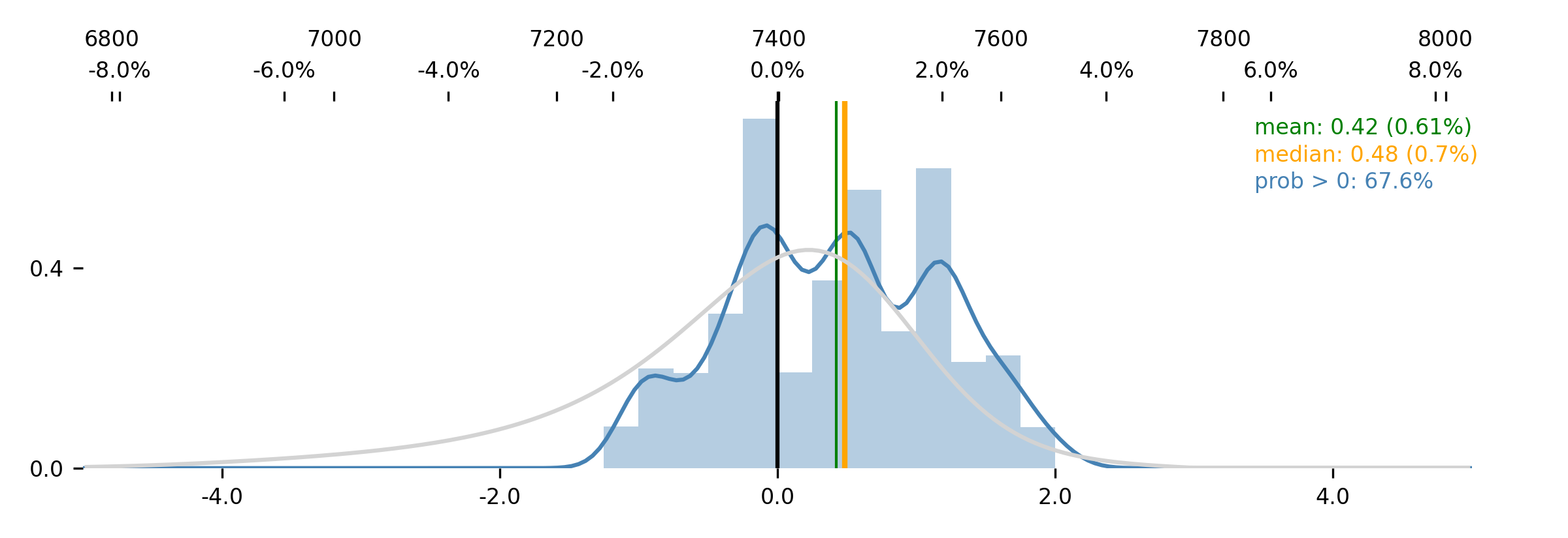
We've been wrong, so far. And Jim has been right. And he's still, as of today, bullish, with a familiar ~70% chance of upside. A solidly bullish-stable distribution.
We have no basis with which to argue with this, except that we see the potential for big, nasty geopolitical developments. We have another three weeks to two-and-a-half months of time left on our puts, even though their value has nearly been sliced in half since we bought them.
Our PnL (which was +44%) is now officially in the red on a YTD basis. It feels very, very bad. But that's the game that we've chosen to play. And we're going to keep playing.
One interesting data point: DIX printing 43% on Friday. That's finally getting into the lower range, and it suggests that genuine discretionary buying interest has shriveled up. An S&P
Component GEX of $21bn, meanwhile, suggests that "genuine discretionary buying interest" has given way to speculative call-buying behavior. The last time the component GEX was that high was 2021, in the midst of the COVID lockdown gamma-squeeze gamble-a-thon.
So maybe this doesn't make sense, but let's not forget that it doesn't have to.
Now instead of trying to make sense of it, let's hunt for some actual edge.
Delta-fudging
Last week, we reintroduced the topic of "GEX Prime." As a matter of faith, we believe that there must be some abstraction of the concept of GEX that's currently active and useful in the broad market, since option dealers essentially must use inter-asset correlations to reduce the need for delta-hedging—if they wish to be competitive.
This "race to the bottom" of avoiding the expensive delta-hedge means that the bigger your "fudge factor" (your willingness to use an unstable correlation as a basis for neglecting a hedge), the tighter you're going to be able to quote an option. But fudging the numbers is dangerous. and has externalities, and we expect that if we can find our when and how those fudges are happening, we can find some good long or short signals, too.
Since this is probably going to be a fairly long process, let's just take a swing at it. Below will be a stream-of-consciousness scatterplot bonanza, with no promises of... anything.
* * *
Ok, so the idea is [probably] that an option dealer has exposures across the whole panoply of products, and what we're particularly interested in is the interrelationships between the component stocks of the S&P 500 and the S&P index itself, because this Russian doll of option and volatility pricing is a natural place to expect "fudging" (it's less likely that an option dealer will use, like, commodity deltas as a hedge for stocks). So, e.g., if a dealer is selling a bunch of TSLA calls to silly speculators, they're also buying a bunch of SPX calls from silly index call overwriters at the same time, and it would be logical to "cancel out" some of those TSLA deltas at some logical ratio, where that logical ratio would be a function of how TSLA wiggles with SPX. And since TSLA's price-trend (P) has something like a +0.31 Pearson correlation with the index, maybe we'd say that we'd only buy $69 of TSLA deltas to hedge every $100 of exposure, since the other $31 is more-or-less going to move with SPX.
Is this exactly what a dealer is going to do? No. But it's close enough that—if there's any signal value in this thesis at all—we're absolutely going to see a shadow of it here.
It, uh, feels like we should start small, particularly since most of the option open interest is concentrated in just a few index components. Really, we should be able to plot out the relative wiggles in a few Big Tech names and capture much of the action. In any case, this feels like a much more manageable way to begin.
Methodology: Find the rolling correlation between the
normalized prices (P) of the same stocks we mentioned last weekend (AAPL, AMZN, GOOGL, META, MSFT, NVDA, TSLA), and plot, on a day-to-day basis, the
residual of the most recent data point against an OLS regression line of the correlation. Express that residual as a... hmm... yeah, express it as a percentile, based on the
empirical data (i.e. let's
not assume it's Gaussian).
So what that means is that if TSLA went down a ton, and SPX is flat or up a bit, that'll show up as a very low percentile event for TSLA's relationship with the index. And if AAPL went up a ton at the same time, that'll be a really high percentile event for AAPL versus the index; and since these are both very "distant" from the 50th percentile (median), they'll accumulate to a "fudge stress" score. A higher "fudge stress" occurs when more things are moving very independently from the index.
...
So we haven't even started writing code yet and we're feeling a problem here: We intuitively associate disparate index component performance ("rotation") with a healthy market (is this a normal interpretation?). We'd say that one stock going up while another goes down is a sign of "rationality" or "intentionality," which we'd think is a stabilizing thing, actually—so we're already wondering if a higher "fudge stress" score is actually going to be a bullish thing. Like we already said last weekend...
Does [this idea] sound like it makes sense? (Right—which means that the exact opposite is just as likely to be true.)
The other problem that we're already wondering about is whether just looking at the Big Tech names is really going to tell us much, since while maybe we're right that disparate performance between stocks is intuitively a good thing, there's so much overlap between the Big Tech names and what drives them that their relationship doesn't really gauge "rotation" in the market. For that, we'd absolutely want to be looking at things like Energy and Staples and Financials and Utilities. Really big wiggles in those things feels interesting.
Ok, put a pin in those thoughts. Let's keep going.
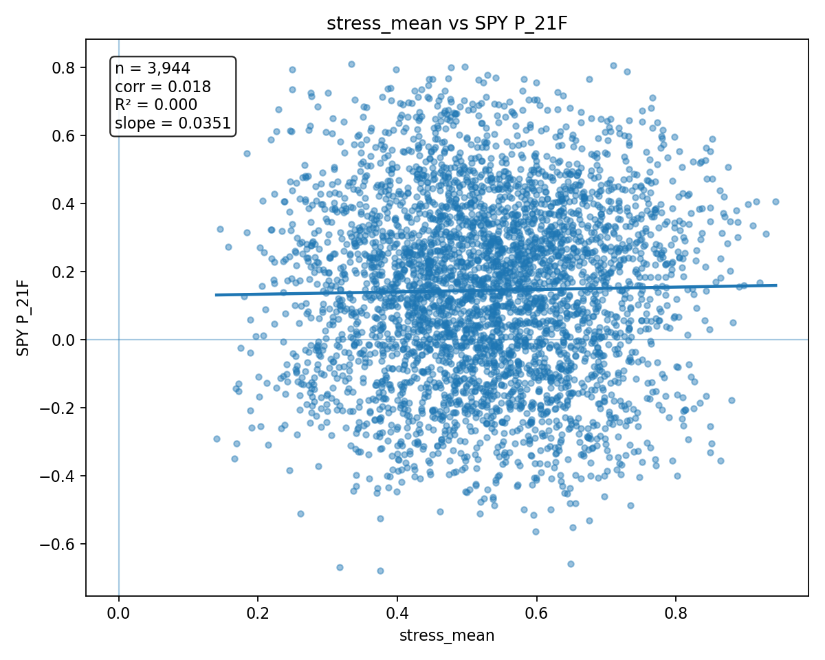
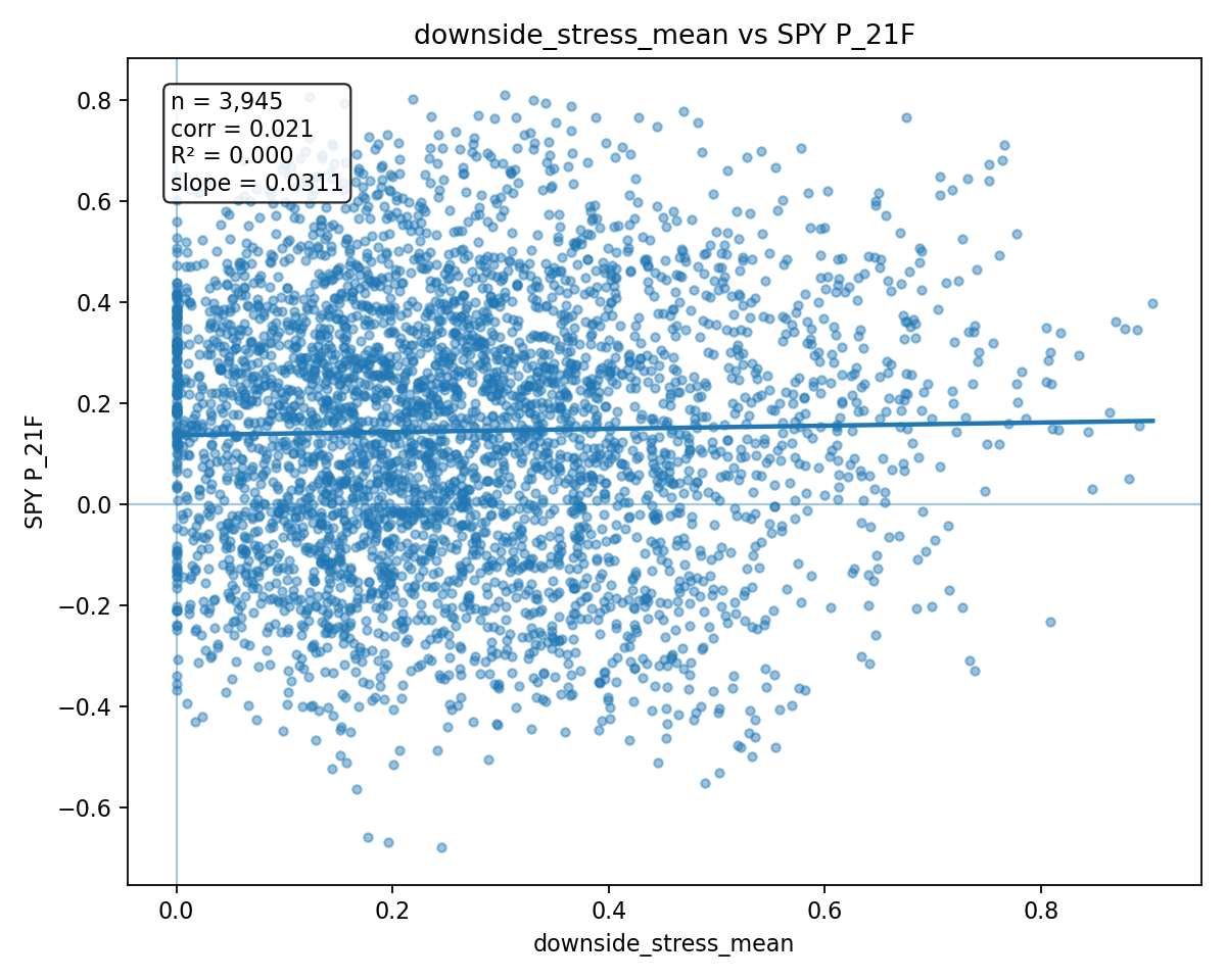
Let's plot an aggregate Big Tech correlation "stress" against SPY's 21-day forward P value (column P_21F), which will give us the vol-normalized price-trend of the month following the signal. "High stress" means more unusual wiggling, up or down, for the components. I.e., more "breaks" from the usual index correlations.
Not... very interesting. The absolute most "stressful" data (right) does appear marginally more bullish than absolute lowest "stress" (left), and perhaps this is also borne out in the positive corr and slope, but really, this is just a blob.
Ugh. Bad start.
Think.
Maybe we really need to bring direction into this.
Go back to the TSLA example: If a dealer is short TSLA calls and long SPX calls, what happens when the "fudge-hedge" doesn't work? E.g., what happens when TSLA goes up a lot, unexpectedly, versus SPX? Well... that's broadly destabilizing, it seems, since it means that the dealer needs to become a liquidity taker, and it means the dealer is getting hurt by some convexity. Destabilizing? Spread-widening to the market?
What about if TSLA goes down a lot, unexpectedly, versus SPX? Well, that'd be a win for the dealer, since they underhedged their TSLA short calls. Cha-ching. Stabiizing? Aggregate spreads stay tight or get tighter. Broadly, good for liquidity.
Yeah.
Could this mean that, since the market is broadly a bunch of SPX call-overwriters, and then a mixed bag (many call buyers) in the single-name components, that—as in the above example—it's almost always stabilizing and good and bullish and liquidity-improving when individual index components go down (and the more they go down the better)?
(And vice versa, where many individual stocks going up a lot is bad.)
This sounds a bit crazy at first glance, since if individual components are going down, that sounds like the whole index ought to be going down, but in reality there's a huge difference between (1) a couple of these stocks getting pummelled and SPX being mostly flat and (2) all of these stocks doing fine and normal and SPX being also mostly flat. These are totally different circumstances, and in one of these circumstances, it seems like the dealers are probably doing really well (1).
Ok, so we need to look for those situations where the correlation stress is all about the individual components going up a lot, and split that from the situations where the individual components are going down a lot. The former should be bearish (or, honestly, probably neutral); the latter should be bullish (and it should be a matter of degree, where extreme correlation "stress" is pretty clearly bullish).
So let's decompose that.
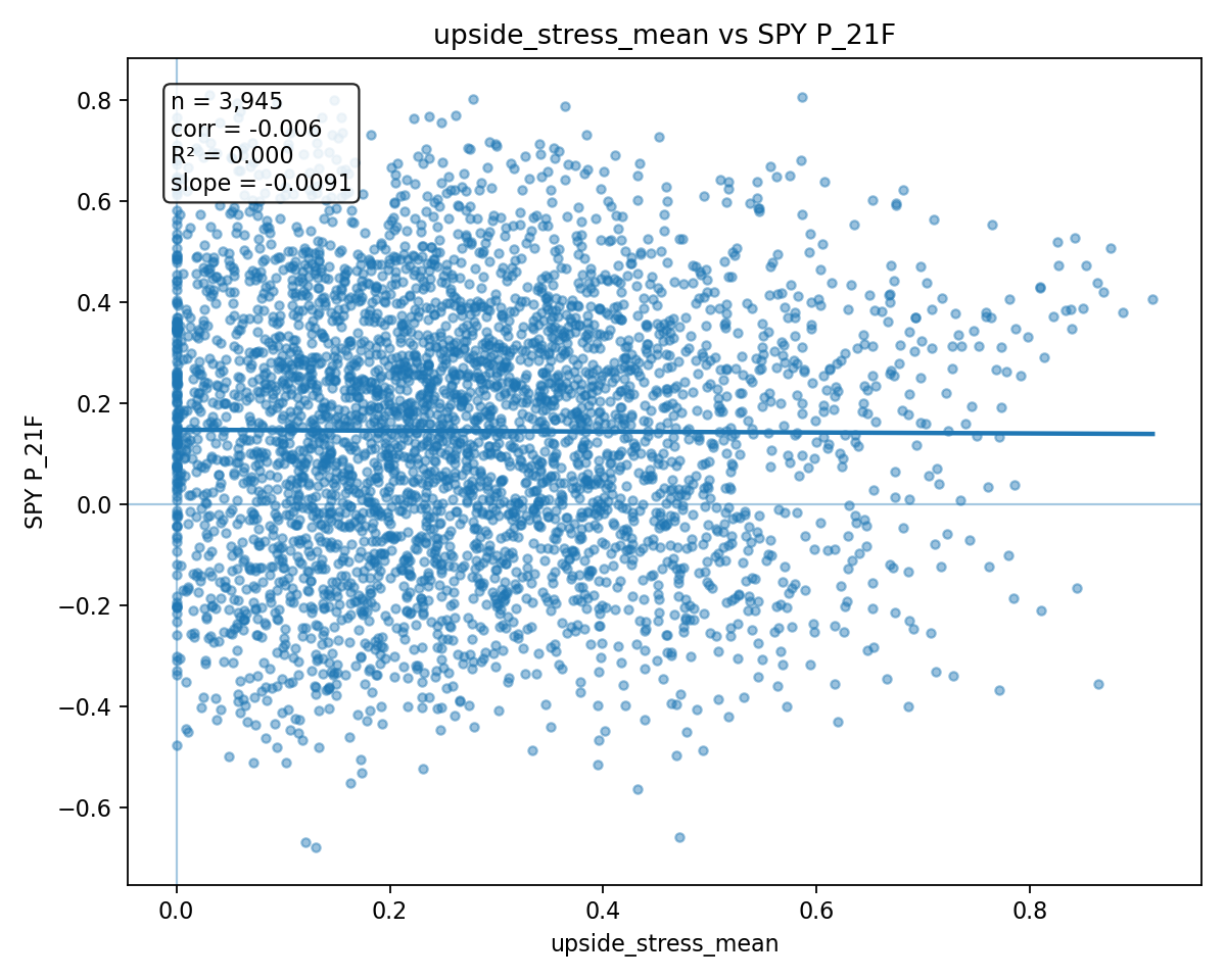
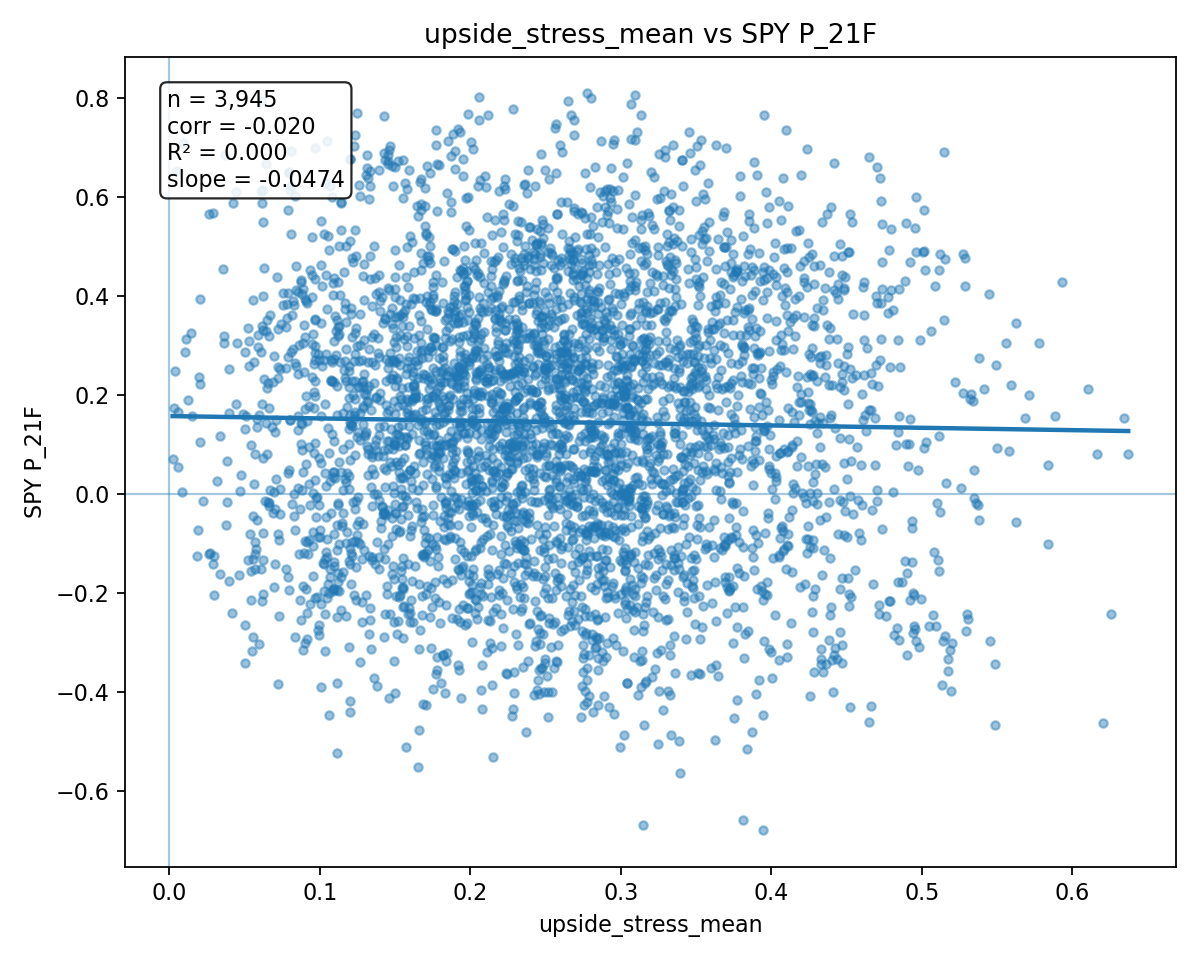
First, upside stress.
Ok, yes. This is neutral. More "upside stress" in the correlations is apparently neutral.
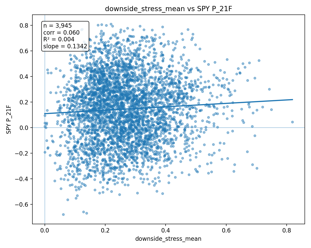
Now we want to see bullishness in the downside stress.
Aaand...
Agh.
Not meaningful.
This is frustrating. We were kind of thinking that our explanation made sense there. Getting a bit attached to the idea, honestly.
Ok, last attempt: We said above that we were already skeptical that the "Big Tech" angle was the correct angle to view this from, and that maybe we should actually be looking at the "sectors" of the S&P and their correlations instead. So let's swap out the Teslas and the Apples for the 11 S&P Sector ETFs, and let's do exactly the stuff that we did above.
"Upside fudge correlation stress" should be bearish to neutral, as before, and...
...it is. So that's good, anyway.
Now for the moment of truth, "downside fudge correlation stress" should be bullish.
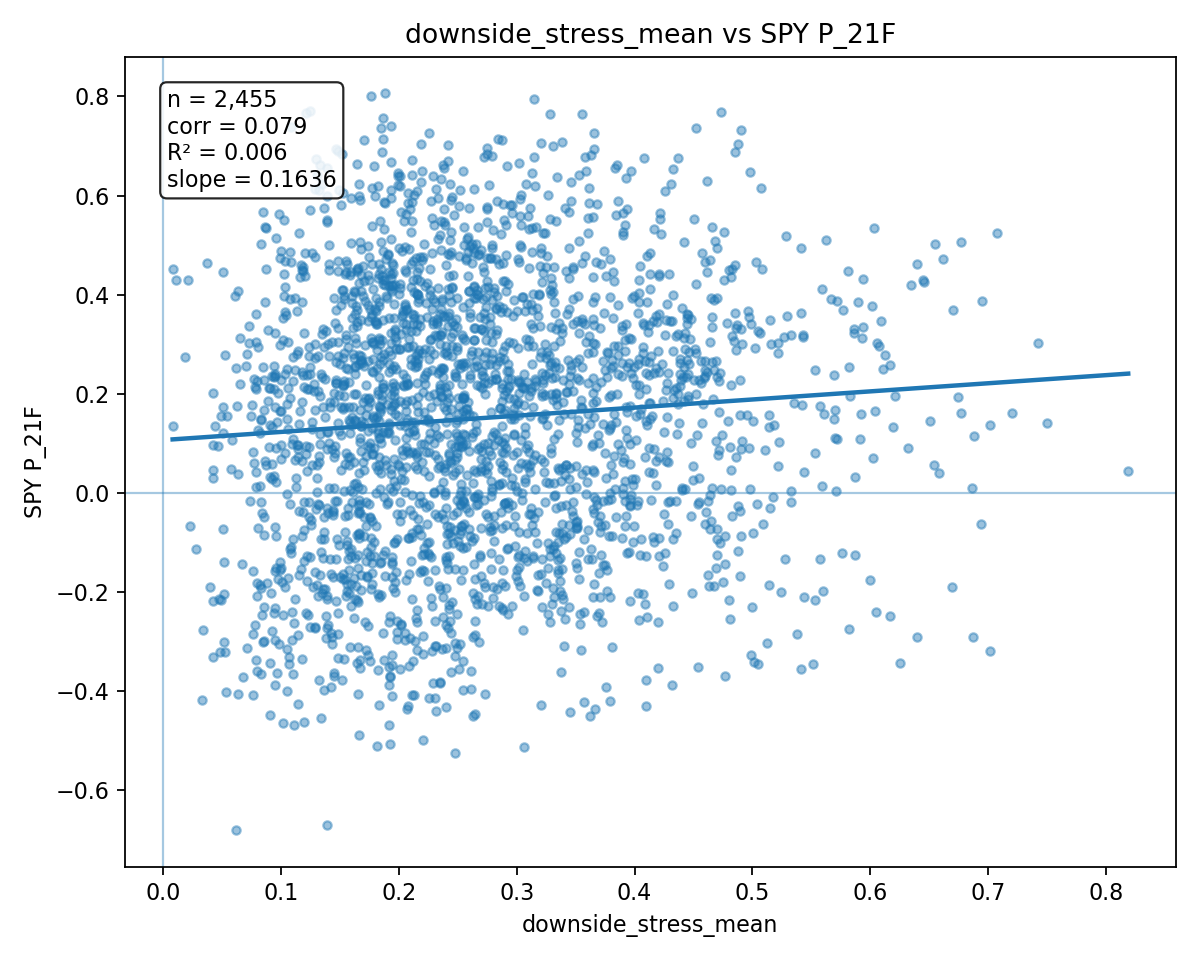
Ok... yeah. that's not too bad. The slope is visibly positive. There's something here. And that means there's something in the idea that a couple sectors having some downside deviations from the broad market is a bullish thing for the broad market, and we like to think that it's because our explanation (the TSLA calls thing) makes sense.
But this isn't quite strong enough on its own for us to want to go much further with the idea, so let's take one more step to validate: If we're right about our explanation here, it's going to be a much stronger factor in more recent years as option market-making becomes bigger (more volume and OI having a larger effect on the index) and more centralized (making the dealer-fudging explanation likely to impact the broad market).
This is easy enough to test. All the above data is from 2010 to present. Beginning around 2016, we got more SPX weeklies listed and rapidly expanding option volume, so the slope of those two lines should be more exaggerated in later data. And then, frankly, we should be able to see an even stronger effect in the last couple years as options get even bigger and Citadelification really takes over and other shope (e.g., Jane Street et al.) are competing really hard for the same pie (maybe just the last two or three years?).
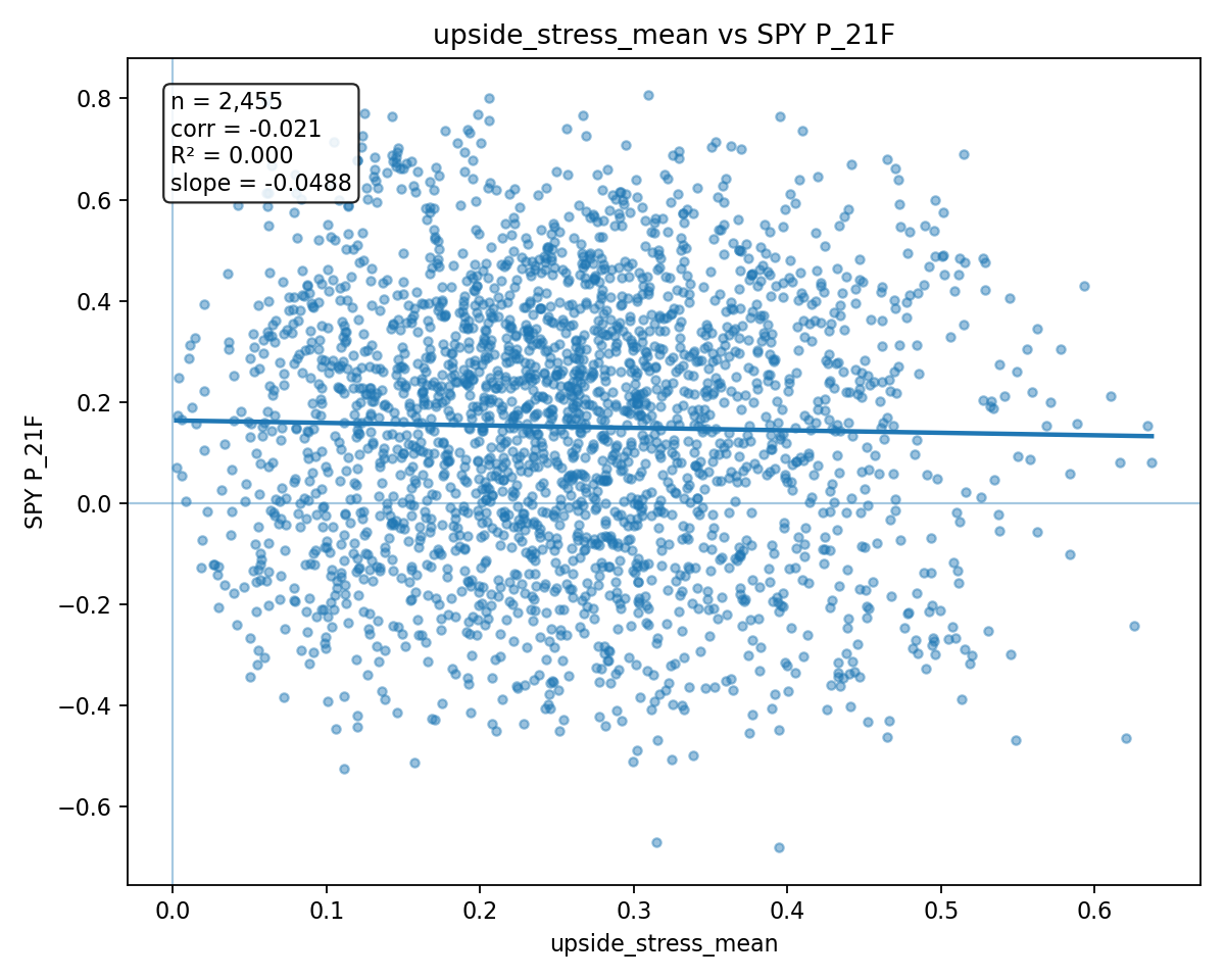
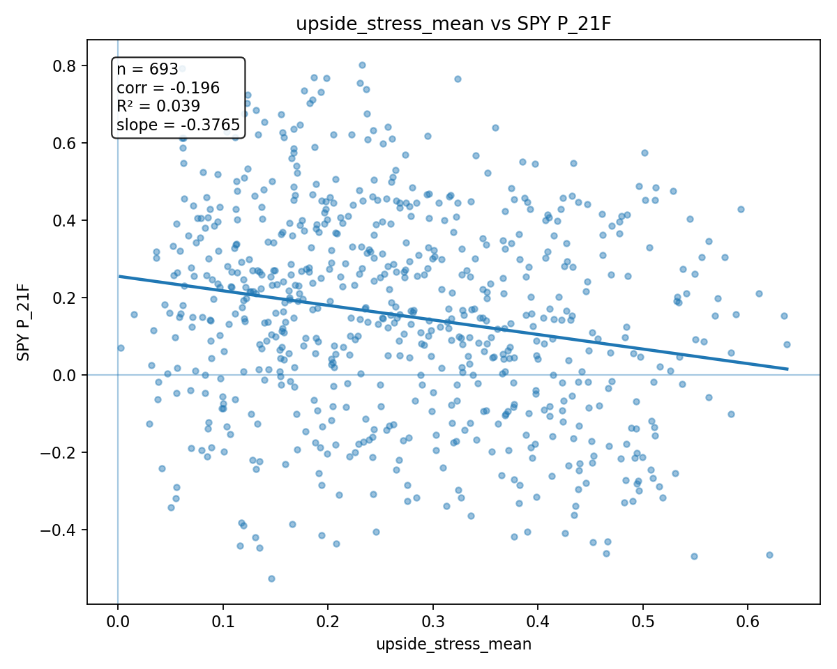
So let's do the "upside fudge-risk stress" from 2016 to present. Again, this should be bearish to neutral...
...and it is. Marginally more bearish than the 2010-to-present. So that's good.
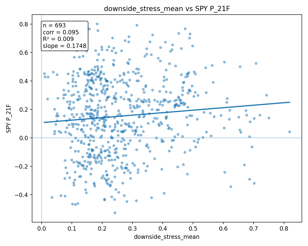
More importantly, let's see if the 2016-to-present "downside fudge-risk stress" has a more positive slope.
Yes! Correlation goes from 0.06 to 0.079! That's definitely the right idea.
Now the final test—let's do 2023 to present. The last two-and-a-half years.
First, the upside risk.
Oooooh! Now we're talking! What a fascinating plot that is. This means that the strong, individual outperformance of individual sectors has been a significant absolute drag on SPX performance. And our theoretical framework is that the outperformance of individual stocks/sectors, versus the index, hurts dealers, who more or less must "fudge" their delta-hedges.
This is neat.
And now the downside.
Yep! Still more bullish the more unique sector downside is happening. Strongest correlation, r-value, and slope yet.
This is something!
"Delta-fudging" is real. And it has an impact. And its impact grows greater with time. And maybe we can track it.
So many questions still to answer. But this is a good start.
Enjoy the week!
The SqueezeMetrics Team