All the charts and data we refer to can be found on the Yacht Club page.
Hey everyone,
Here was the
goal for this weekend:
[W]e'd like to give you folks less model output, and more model input. No more black-box "mean, median, vol" stuff coming from our internal k-d tree methods, but instead, better-defined raw indicators with consistent and useful normalization so that you can plug things into your own models with minimal fuss (instead of backtesting using the outputs of our messy time- and distance-weighted nearest-neighbor algorithm).
Well, we did it.
As of tonight, the Dash, the Chart, the Ideas page, and the API all query the same simplified format. Since many of you are routinely pulling data from the API, however, you may not like the sound of this (since there will be [approximately] one million little nagging and horrible things that will need to change in your code to make this work). But behold—we're not going to leave you entirely in the lurch:
To keep getting the old data format, append "_old" to the /symbol and /latest endpoints. We'll keep generating the "_old" data for at least a few weeks, until we can win everyone over to the newer methods.
https://squeezemetrics.com/monitor/api/symbol_old/AAPL?format=csv&key=YOUR_API_KEY
https://squeezemetrics.com/monitor/api/latest_old?format=csv&key=YOUR_API_KEY
Need convincing? We will help you build and tweak your brute-force nearest-neighbor or k-d tree methods to extract exactly what you want from the data so that you can derive exactly the kind of forecasts with the leanings and subtleties that you want. Just ask! We have Python code snippets! Let's make this work!
So let's go over what the new columns look like, and why they look the way they do, and why we're still providing "normalized" data, and how that normalization is done, and what that means, and other stuff like that, and why it's all really good stuff.
But first...
- Pretty boring
- Melt-up?
- Neighborly
Pretty boring
It's bullish stuff, overall. Summery, high-liquidity stuff.
We left off here last weekend, thinking it'd probably be a flat-to-up week—that SPX would snuggle up into the highest-GEX region above spot, and there wouldn't be much to do other than watch it happen.
Yes.
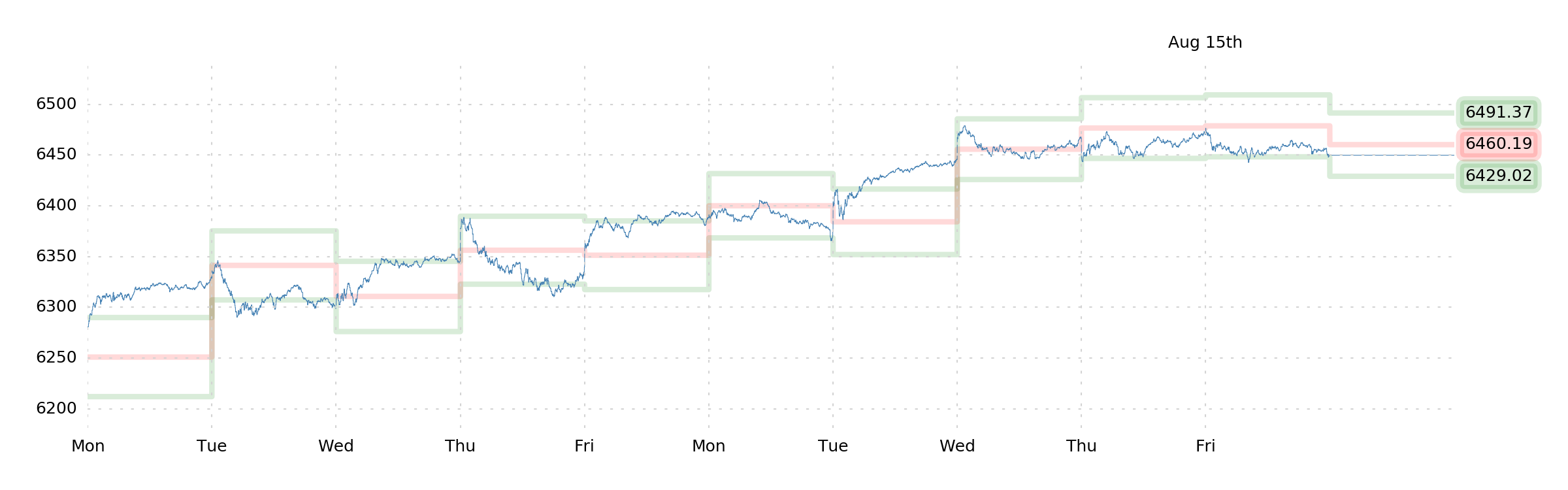
Indeed, our only plan was to take intraday SPX trades based on SuMo bands and 0DTE dealer hedging, and that's exactly what we did. And it went very well!
(Actually, notice that every day this week played nicely with the SuMo bands, getting tripped up at Mid, rocketing through Momentum, and getting held up at Support. The only exception was Wednesday, which didn't disobey the rules, but fell from above Mid and hung around at Mid for most of the day. We would venture that this price-action was owed to the 0DTE data for the day, which had us shorting SPX out of the gate. A very good week for intraday trades, overall.)
Now what?
Melt-up?
On
Friday, we reviewed the data and concluded that the post-OpEx environment looked... "pretty boring."
Do we get things to start wiggling more after the OpEx? Yes, probably. But VIX at 15 probably precludes any straight vol bets that can take advantage of this, and Robot Jim doesn't seem to think there's any particular opportunity except in continued bullishness.
This seems like it's still the right interpretation.
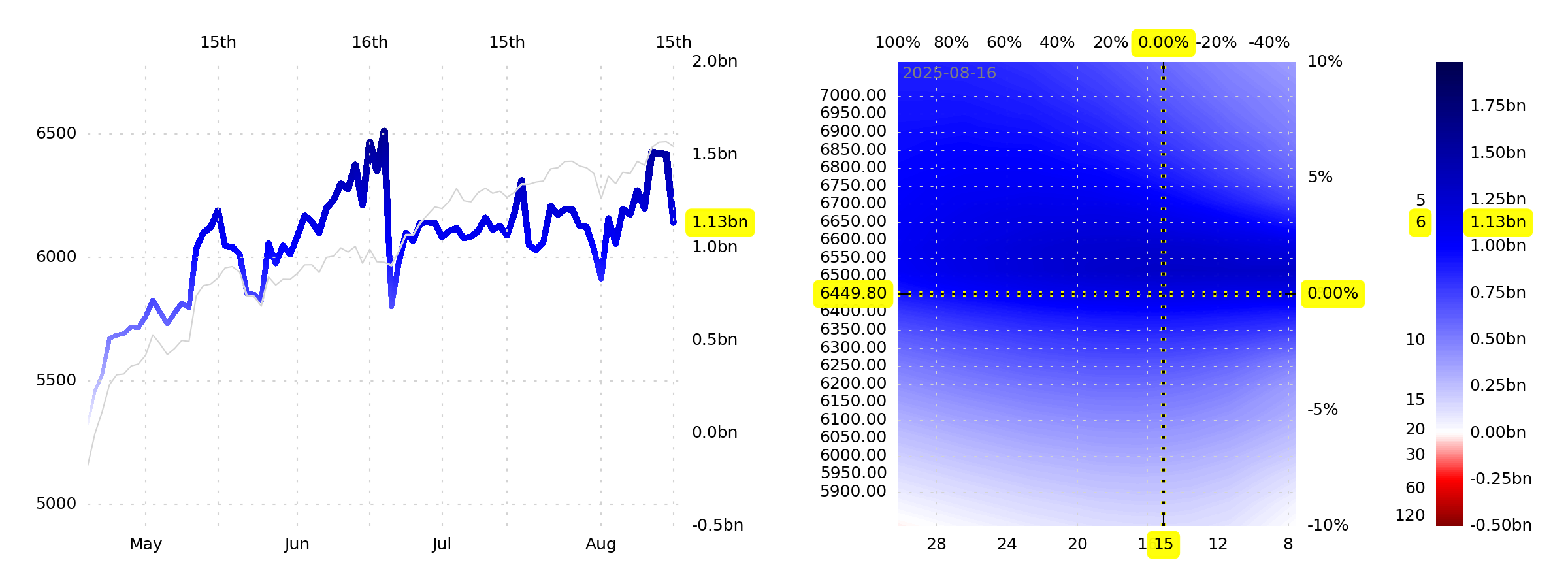
True, GEX+ fell, as it tends to do after a big monthly expiration...
...but it's still meaningfully above $1bn per SPX point, so liquidity is still "good." True, you should expect to see some broader daily ranges in the coming week, but it doesn't really look like you can take advantage of this, except—perhaps—by leaning long with an SPX call.
Arguably, this is the best bet (Jim thinks 6500+ is definitely on the table).
The bet is that we get a horrible, continuing "melt-up." The bet is that there's nothing to stop "overvaluation" and "animal spirits" and all that. The bet is that people are newly afraid of inflation with the hot PPI print last week and a higher likelihood of rate cuts coming down the line. The bet that stocks are the only defense against such an environment. Cash-flowing businesses.
But if this is our bet—that equity PnL and inflation-protection is desirable for a number of portfolios right now—then maybe we should try a more focused bet (especially since it feels like there's a growing awareness that the index is currently highly concentrated). Is it a good time to bet specifically on the "cash-flow-generating" aspect of equities instead of the AI hype and "growth/beta"? Maybe it's a moment for the small-cap factor? How about some solid Russell 2K businesses? Some "value"-oriented stocks?
By our numbers, this isn't a great time for "small-cap value" (but then there... aren't a lot of good times for small-cap value). Our intention, then, will be to just buy some SPX calls, then pick a few spots on our own. For instance, Skyward Specialty Insurance (
SKWD) shows up as a fun potential long (a 1-month call option, perhaps?). How about SharkNinja (
SN)? Lots of fun possibilities (check out the
Ideas page)!
Small, cheap bet on upside for the index this week. Fixed-risk. No stress.
Neighborly
Here's the new data format:
DATE,P,P_NORM,V,V_NORM,G,G_NORM,D,D_NORM,IV,IV_NORM,P_NN,OPEN,HIGH,LOW,CLOSE,VOLUME,ADM21,R_21F,P_21F
Twenty columns (20), down from fifty-nine (59). That means it's easier to read, easier to download, easier to store, easier to park in system memory, easier to parse, and, hopefully, easier to understand.
We have a section of the
Documentation page updated to reflect this new data, but since we're all here, let's go over the important things right now:
Firstly, there's *_NORM (P_NORM, V_NORM, ... IV_NORM). These are the normalized P, V, G, D, and IV variables. "P" is raw, "P_NORM" is normalized. The normalization uses the hyperbolic tangent (tanh) to smush data into the [–1, +1] domain, and uses a rolling 1-year lookback to score current data versus past. It's... fairly clever, we think, and it's broadly applicable to any time-series indicator, so long as it's already been de-trended or z-scored or something (or naturally has mean-reverting characteristics).
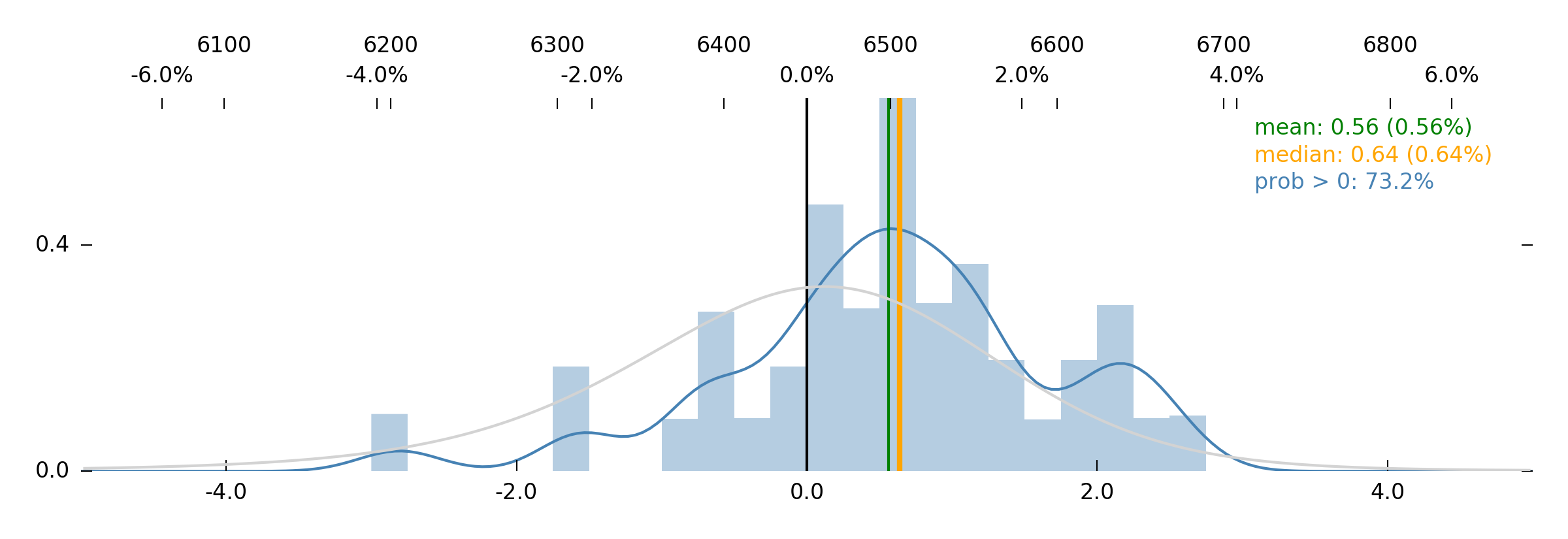
Then there's P_NN. This is short for "Price-trend (P) nearest-neighbors." This is a forecast, using the nearest-neighbor algorithm, but instead of looking at a vol-normalized-1-week-return-that-uses-a-1-month-variance-as-the-basis-for-the-normalization-of-the-return (confusing) or using a raw percentage gain/loss (misleading), we're just using what we already know and love: the price-trend indicator (P).
P_NN is the average P indicator value that showed up 21 days (1 month) after the current nearest-neighboring historical data. It's the normalized price-trend that materialized over the course of the month following the signal. E.g., if P_NN is 0.50, that means that the nearest historical analogs to today resulted in an insanely strong average P of 0.50—huge upside. Our nearest-neighbor model for P_NN is using a generous 12.5% of nearest data, which is the same thing that you get when you click "Nearest" on the Chart three times (cutting the data in half three times, leaving 1/6th as "nearest neighbors").
Next, ADM21. This is the Average Daily Move, in percent, of the last month. That's it. It's a measure of realized volatility as well as a useful normalization factor (e.g., it's used in constructing P and V).
Lastly, R_21F and P_21F. These are the 21-day forward simple percent Return (R_21F) and 21-day forward P (P_21F). These both are here for your convenience, so you can make scatterplots and feed models without "shift"ing, "roll"ing, or whatever other named methods are out there that pull data from N rows forward or back, inevitably leaving blanks and NaNs and requiring you to think about whether you're accidentally introducing future leaks into your tests.
That's it.
Historical MEAN, MEDIAN, and VOL forecasts are gone. Historical pair-wise (e.g., PV_MEDIAN) forecasts are gone. The model that generated these forecasts used complex time-weighting and distance-weighting on its limited query set (126 days) of nearest-neighbor data. It was a black box, and it demanded that the user run backtests on a model that was fairly opaque.
We don't want you to keep doing this. We want you to have more control over the model—if you're going to use one. If you're dead-set on being a nerd, you can find any number of k-d tree implementations that have been around since the 1950s, and you can plug them into your code, try your own model weights, and go from there. Again, we'll help point you in the right direction if you want to do this!
Otherwise, you can just do what we're doing and click around on the Chart, watching as r-values shift with changes in data slices, or watching how r-values and forecasts shift as we click and drag, then pan over discrete periods of time. It's all there! We've spent hardly any time in the code-mines looking for ideas lately. Everything we really want to see is now on the Charts (well... except for one thing... but we'll get there).
So try out the new stuff. Ask questions. Click around.
We just made a lot of changes, and we know that things are going to break and need to be addressed, so we're not going to make any grand plans for next weekend. This week, we're available to talk about API queries and k-dimensional tree models and nearest-neighbor algorithms and backtesting and all that stuff. Office hours open. Let's talk.
Enjoy the week!
The SqueezeMetrics Team