All the charts and data we refer to can be found on the Yacht Club page.
Hey everyone,
So we have these "predictive correlations" now, which are built on top of the "Price" indicator, and which we now have little buttons for so we can explore them, and which have been causing us great torment.
We are tormented because we click on the correlated tickers, and the correlations are
fascinating, but we simply cannot wrap our wet little brains around it. We wonder—what's the big picture? We want to see it all! And that's pretty much where we left off
last weekend:
Is it worth trying to map out these predictive correlations a bit more comprehensively? We really don't want to do that, but maybe it's important...
Our first thought to accomplish this:
Plot it all out, every ticker, on a network. Like a
"force-directed graph" drawing. Each node is a ticker, and between each of the tickers are lines, arrows, describing their relationship (like the direction of the arrow, the color of the arrow, the width of the arrow). Then we can follow the relationships and begin to see patterns. Right?
This... didn't work. There are too many relationships, and tickers have strange, and sometimes strong, predictive correlations with other tickers that don't "cluster" in distinct groups. And since we absolutely want to be able to see those weird, offbeat relationships, we need a different method.
A
circular dendrogram, perhaps? A dendrogram would collapse all those relationships into a few pathways, making it more readable. And then if we add interactivity, we'd be able to explore those relationships. A better use of visual space, to be sure!
Nope. Still a mess. What we really need is a grid, where each ticker is repeated twice—once on an x axis and once on a y axis. And then where the coordinates of all the tickers meet on the grid, we display a color, indicating the nature and intensity of their relationship. This way, our eyeballs can see every single interrelationship at once.
I.e., a heatmap.
We always end up making heatmaps.
So let's make another heatmap.
But first...
- not good, not bad
- calls but just a tad
- big hot plaid
not good, not bad
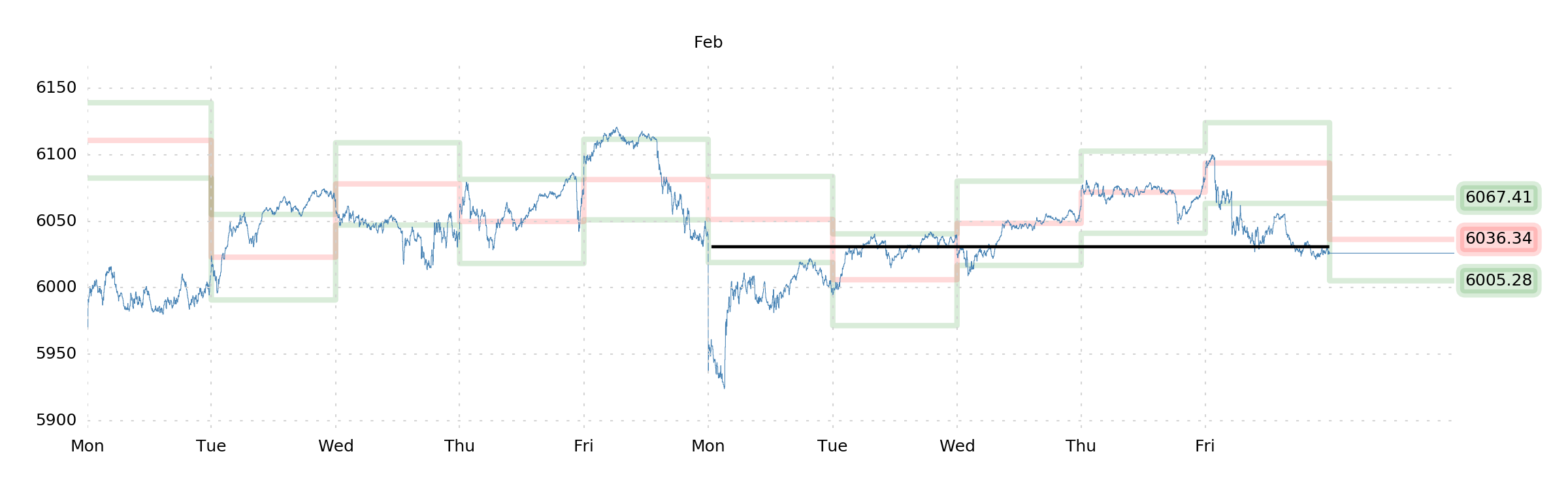
"Gently long gamma" and "carrying a bunch of short delta" was where we left off in last weekend's prediction.
The index went down 0.24%.
Toward the beginning of the week, our "gentle long gamma" did well, and our short delta definitely performed. Gradually, our PnL flattened out, leaving us with a shrugworthy performance.
As of Friday at the close, we have no position. Nor are we sure we want to have one!
calls but just a tad
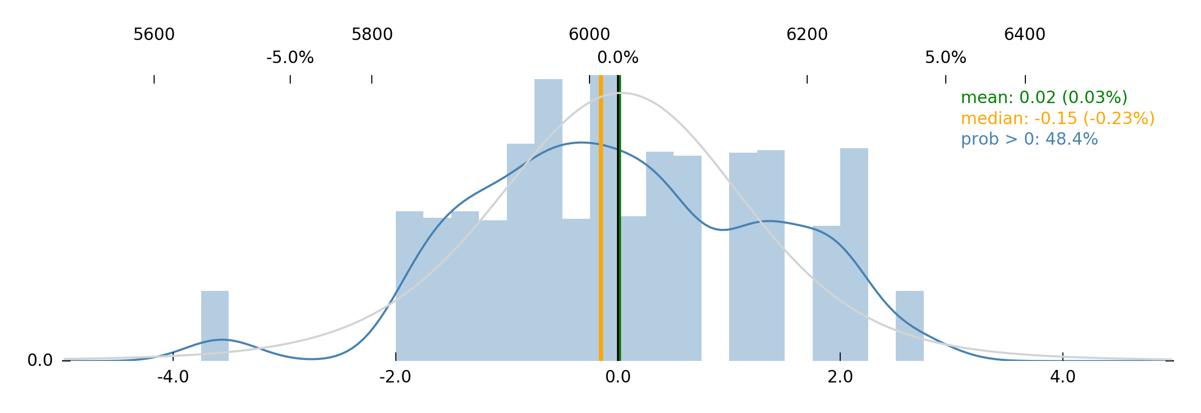
Because Jim's distribution is not too inspiring.
A 1-week probability of upside of 48.4% is certainly not an endorsement, and so we won't likely be getting linear-long SPX—but at the same time, the best trade looks to be a gamble on an outsized move toward 6200. Jim thinks the probability of getting there is a bit higher than the market believes.
This is, perhaps, worth a small OTM call position. An acknowledgement that, perhaps, the probability of a 2.0 MAD move is indeed underappreciated by the market. And while we don't think there's all that much to get excited about, this is one of those times where the cost of the option is probably less than the opportunity cost of missing out on a stupid little rally.
So while we wait for other stuff to happen, let's take a very small bet on that upside.
And while we wait for other stuff to happen, let's talk about correlations.
big hot plaid
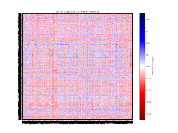
After our other attempts failed, we resolved to build a heatmap to plot out the predictive correlation interrelationships between all of our tickers. But now, a new problem: A plot with over 5000 tickers on each axis is... big.
Suffice it to say that we fussed with this for a bit—and the solution ended up being that we had to use GPU-accelerated methods. Yes, we needed to use the graphics card to get this plot printed out in such a way that we could reasonably zoom and pan on it. Because it's big.
And so, without further ado, we give you...
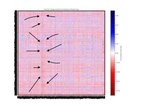
A plaid shirt?
Ok, let's try to figure out what we're looking at. The x axis is the "causal" axis here, and the y axis is "effect." So if there's ticker XXX on the x axis and YYY on the y axis, the color plotted where they meet on the grid is indicating what XXX does to YYY.
The color itself tells us whether the predictive correlation is positive (blue) or negative (red). What this practically means, then, is that blue indicates that the tickers are "allies," and red indicates that they're "antagonists." I.e., blue means XXX "pulls" YYY with it when it moves up or down (allies). Red means XXX "pushes" YYY in the opposite direction (antagonists).
Gotta think about this for a second... this is information-dense. Which is good, but it hurts to think this hard. The other thing to understand about the map is that we grouped tickers by sector, so, e.g., all of the "Consumer Discretionary/Cyclical" stuff is next to each other on the axes. We thought this might help show us patterns. Ok. Let's try to figure out what this plaid shirt is telling us...
The first thing that jumps out at us is that there's a visible strip of red that runs vertically. SEE IT? We drew some arrows to help.
Which means that whatever tickers are under that strip, on the x axis, are "antagonists" for the whole rest of the market! (Which means that those tickers tend to "push" the rest of the market up when they go down; and "push" the rest of the market down when they go up.)
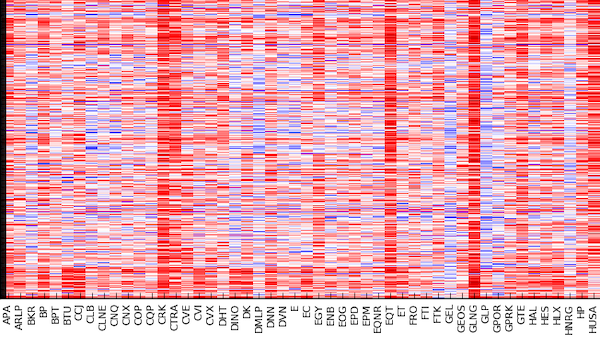
Let's zoom in to find out what they are.
COP? CVI? EOG? Energy!
Interesting! So, maybe we shouldn't try to start rationalizing things right away, but this kind of makes sense, right? The energy sector represents a part of the market that's at once extremely entrepreneurial but also a natural rent-seeker. Because yes, while exploring for and producing energy is risky, and foundational to everything that goes on in the rest of the market—there's also a zero-sum game in the costs of getting energy to the end-user, and when the "Energy" sector is getting paid well, that's often because the commodity is expensive, and "Energy" companies are taking a big cut of that.
The opposite is true, too. Cheap energy and tons of competition inside of the "Energy" sector—things that are bad for energy companies—are great for literally everyone else!
So yeah, it makes sense that there's an antagonistic relationship between Energy and everyone else.
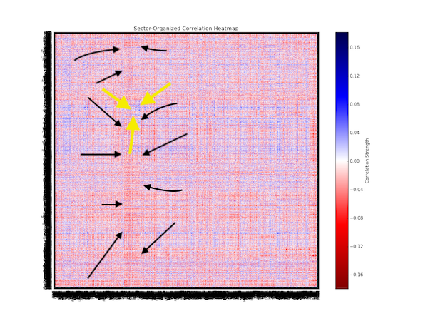
There's so much other stuff to look at, and we're already running out of time—but we're really curious what this bit of blue (yellow arrows) represents.
Because this blue patch means that there's one group of stocks that Energy doesn't have an antagonistic relationship with. What would that be? Let's zoom in on it.
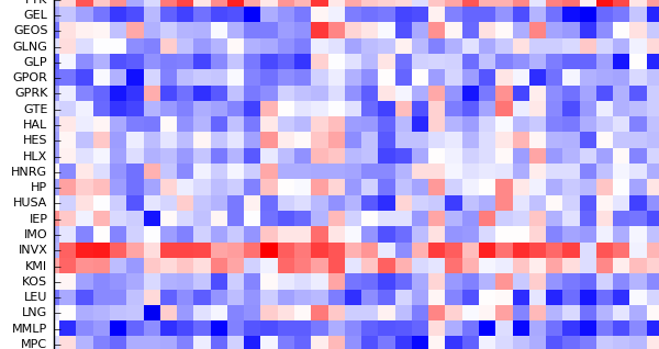
Oh. Heh. That makes sense.
HAL? KMI? LNG? Energy.
That makes sense. Energy does not have an antagonistic relationship with itself. This still makes sense in light of our rent-seeking justification above.
However, even in this tiny little zoomed panel, we can see a rich depth of character, and this is exciting. Whatever INVX is, for instance, does not have a positive, allied, "pull-me" relationship with other energy stocks; and the ticker below it, KMI (Kinder Morgan) doesn't look like it has the usual relationship either. Both of these are reddish, despite being in a sea of blue.
Oh, the trading opportunities visible in this single panel alone...
Dear reader, we must dig deeper.
But in the meantime—enjoy the week!
The SqueezeMetrics Team