All the charts and data we refer to can be found on the Yacht Club page.
Hey everyone,
Back in the thinking chair.
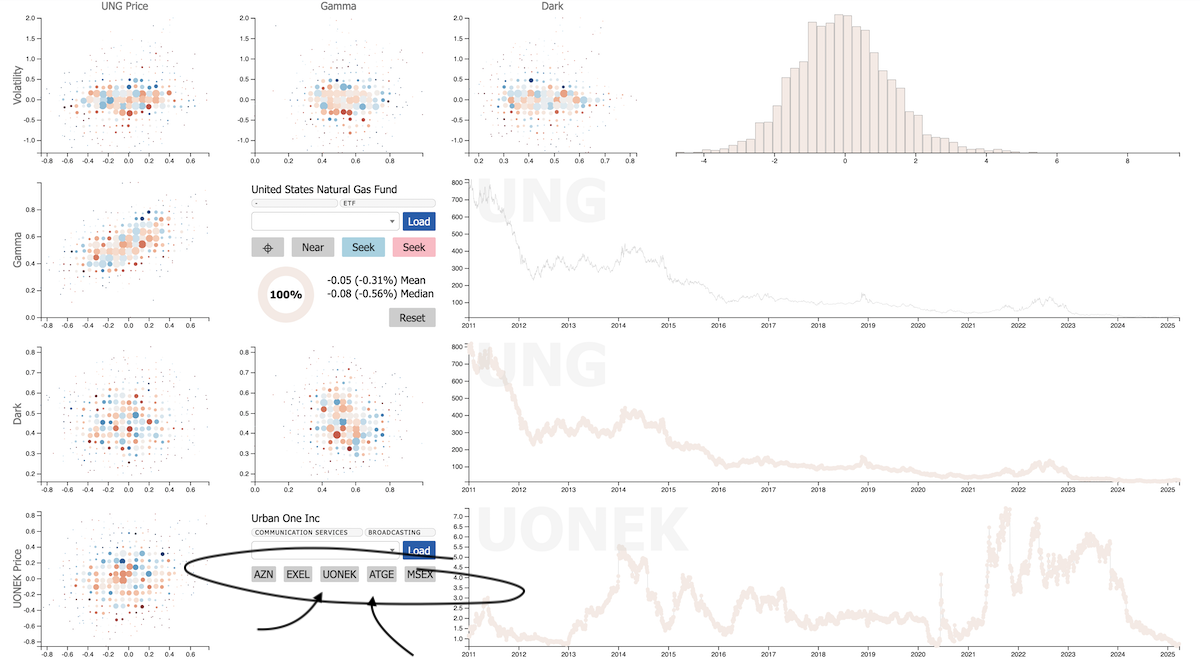
We want to be able to predict what sorts of moves a stock is likely to make by virtue of the relative moves of other stocks. This was the point of looking for "predictive correlations" in the first place, and this is the reason that we have these correlated tickers on the k-scope (circled).
It's been cool. But we've been trying to grasp it better—and it just keeps slipping between our fingers. Which means its time to just do something. Shake things up. And what we're going to do is to try to answer a really simple question that we were just asking ourselves this afternoon:
Hmm. There's a pretty strong historical relationship between Urban One Inc (UONEK) and natural gas (UNG). When UONEK goes up a lot, that tends to predict nat gas going up, and when UONEK goes down a lot, that tends to predict nat gas going down.
This signal is weird and fascinating—but it's not firing right now. There's no trade. But we know there have got to be a million relationships out there just like this one, and there have got to be at least a couple that are firing right now—that are very relevant right now.
How can we find these signals?
But first...
- Anxiety
- More to go
- Humans
Anxiety
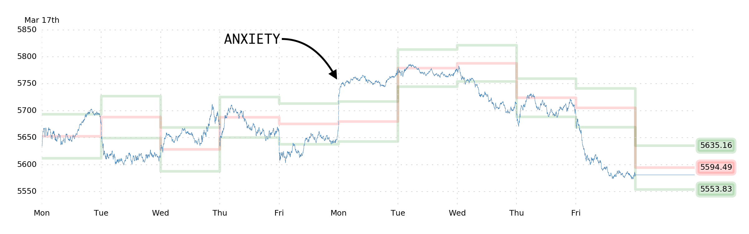
This was our prediction last weekend:
So if we're right this week that the best bet is upside volatility, we're going to have an anxious couple of days where we wonder if we ought to be taking profit.
Funny enough, this prediction (predicting our own anxiety) was predicated on predicting other people's anxiety, namely, the anxiety of portfolio managers who lost money on the recent correction, whose vol hedges didn't print, and who are now watching realized volatility statistics rise, which instruct them to trim exposure. They're waiting as long as they can before they sell, but they're compelled to sell into upside, especially if it's volatile.
Well, we got everyone's max-anxiety-scenario right out of the gate on Monday, and we spent the subsequent three days trimming more and more of our calls, becoming increasingly convinced that we were running out of time.
Friday felt quite appropriate in light of this sequence of events. And if we're right about what's driving the selloff—there's more to go.
More to go
The thesis is that we're witnessing another instance of a
pattern that we've seen since 2015 or so.
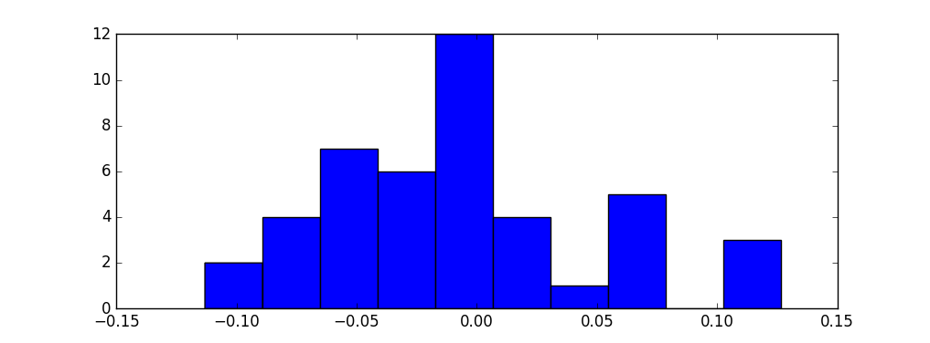
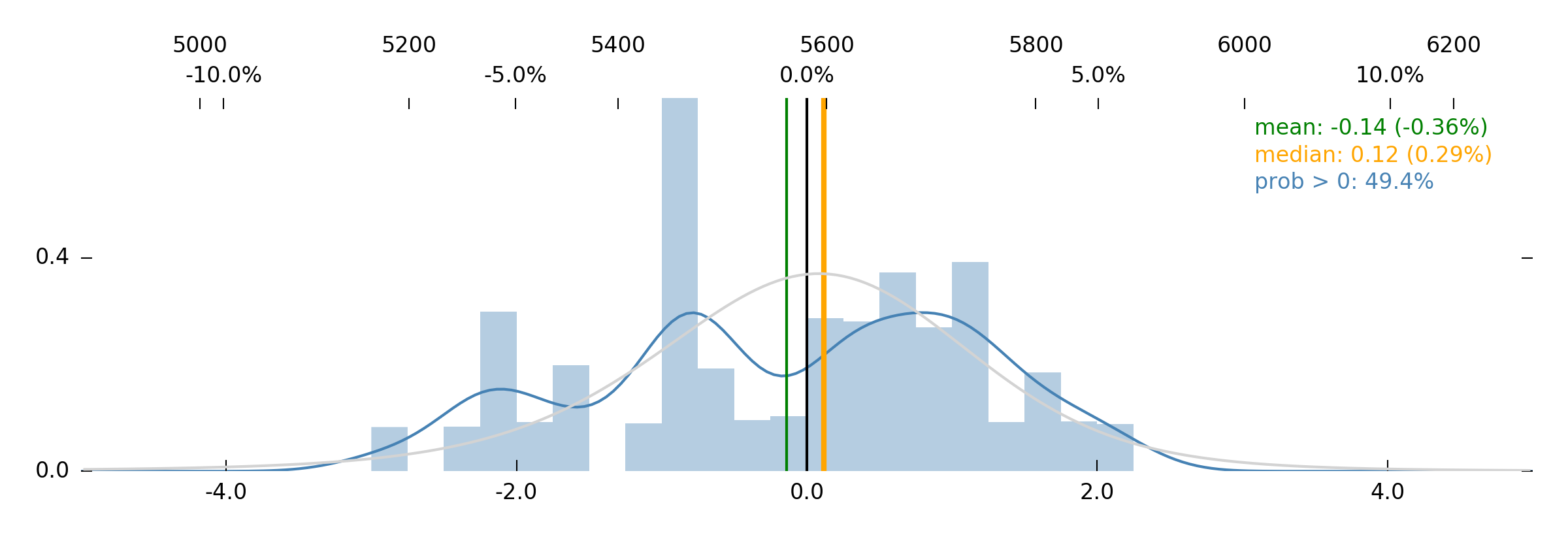
There it is. These are the 1-month SPX returns that you get
after waiting one month after a spike in Volatility in the range 0.35 to 0.50. It has a mean return of –1.50%, and you can see pretty clearly the "lump" of probability around –0.05 (–5% return).
The explanation for this phenomenon?
In the absence of a VIX that "works," portfolio managers are more likely to clench their cheeks through the pop in realized volatility and degross later on. This is a pattern, it seems—and it's a sensible pattern when you understand that folks are having a hard time hedging, for which there is no ready solution.
At this juncture, then, we're inclined to think that SPX achieves lower lows as people get themselves out of a position they've been hanging on to for a couple weeks. Feels bearish.
And lucky for us...
...R0B0T_J1M agrees! A mean 1-week forecasted return of –0.36% is a pretty bearish stance from a nearest-neighbor algorithm trained on the returns of the S&P 500. So we'll take it.
For a bit of extra context, VIX is under 22 right now, and Friday's SPX move was down 2.00%. A 2.00% move is equivalent to something like 40 vol, so VIX at a 21 handle is really taking for granted that the next month of SPX moves are relatively muted.
We think that's a silly thing to take for granted.
Perhaps you recognize in this something that might be called "bear market dynamics," whereby the S&P 500 grinds down without any visible indication of capitulation. We're planning on more of this.
Long puts (for the delta and the vega) seems like a good bet.
And yeah, we're still long bonds.
Now let's get back to thinking.
Humans
What happens if you take a stock, any stock, isolate the five stocks whose price movements have historically best predicted its own future movement over the past 15 years, and then use those five stocks to predict what happens next?
It's nothing new for us—it's a k-nearest-neighbor algorithm with five vectors, where all of those vectors are a vol-normalized 1-month moving average of price (i.e., our Price [P0] indicator) instead of Dark, Gamma, and Volatility. It's creating a multidimensional "space" to search for the historical combinations that are nearest to the current data, and then extrapolating a forecast.
Aaaand we just wrote some junky code to spit out some predictions based on this algorithm! Bing-bang-boom!
Now let's scan the output and see if it makes sense.
...
Ok, the first eight bullish names are super-short-maturity bond ETFs of some kind, because the algo says, "look, risk-free money!" And, well, it's not wrong. And then the next name is QQQ. The Nasdaq 100. So that's kind of annoying, because it's just telling us to buy big growth/momentum, which also might not be a bad idea—but we're looking for more subtle things than just "RISK ON!"
Then there are some muni bond ETFs (
example), which are sort of interesting—but the trouble with that is that munis have strong autocorrelation all by themselves and they're down a lot in the last month, so their own Price signal is pretty bad right now and we probably don't want to try trading that.
*sigh*
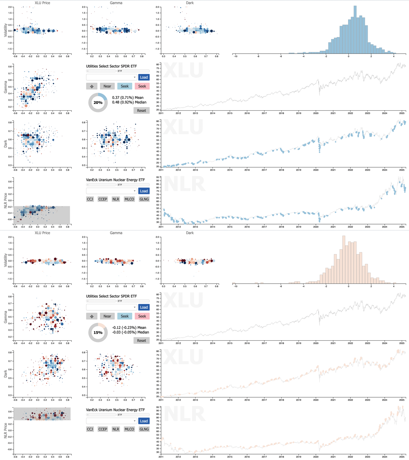
This... already isn't working. What we're trying to find seems like it can't be formalized like this. And maybe that's not surprising, because the stuff we're trying to find is more subtle. Remember, for instance, the relationship between nuclear utilities and non-nuclear? Look at how
XLU is influenced by NLR.
Yes, XLU, the whole sector, is visibly influenced by what's happening in a thematic "nuclear energy generation" basket. When nuclear does really well, that takes some of the wind out of XLU's sails; and when nuclear does poorly, XLU gets a boost.
That's cool! It's a big effect, it's robust through time, and it's sensible! Nuclear, if adopted, has the potential to take a big slice out of the current energy generation and delivery market. So yeah. And this isn't the only cool example...
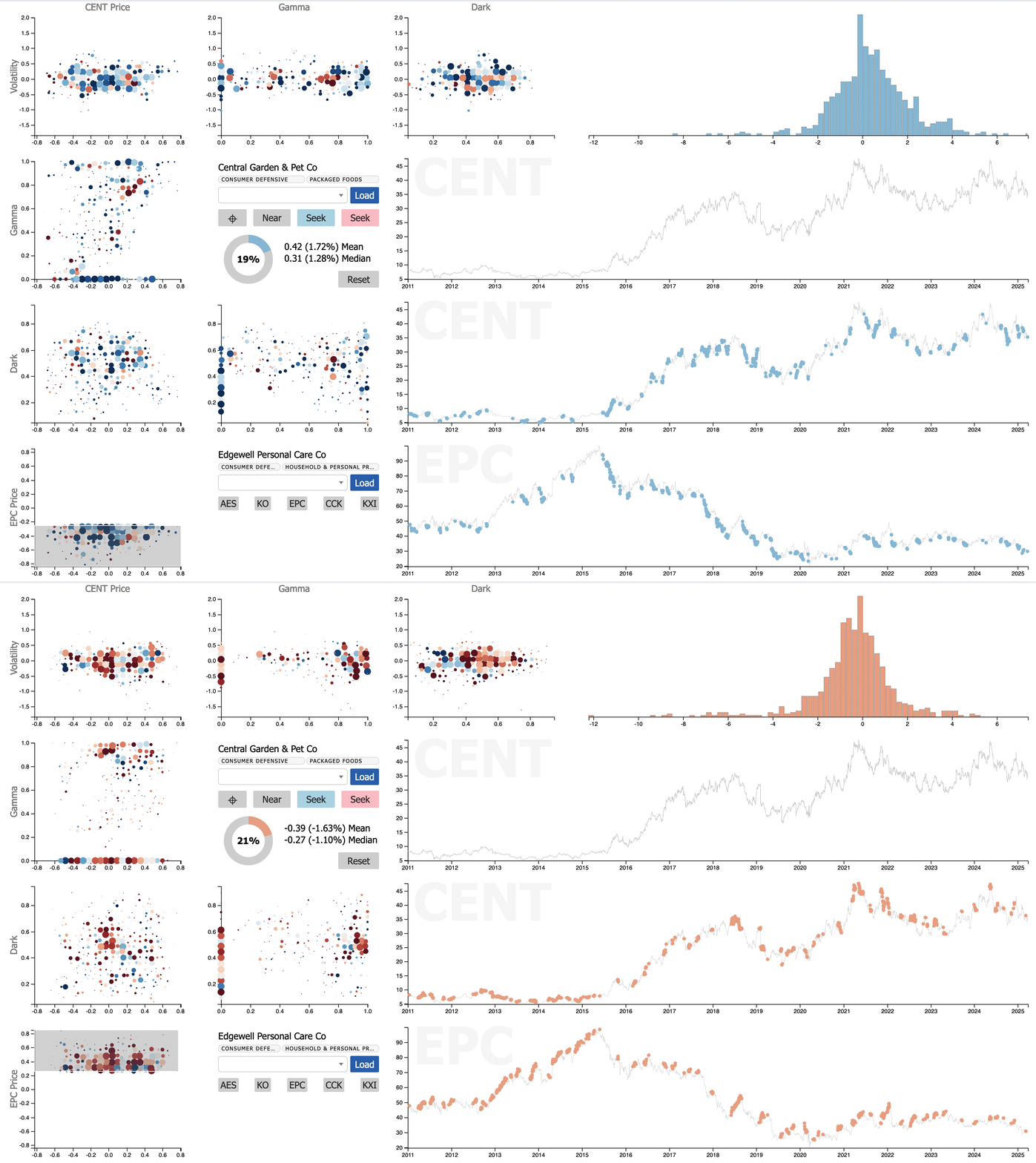
Remember that time we talked about the razor-blades vs. dogs-and-houseplants trade?
Central Garden & Pet Co. versus Edgewell Personal Care Co. It's the story of the eternal struggle between staying inside with your dogs and plants versus shaving and going out somewhere. There it is! On a chart!
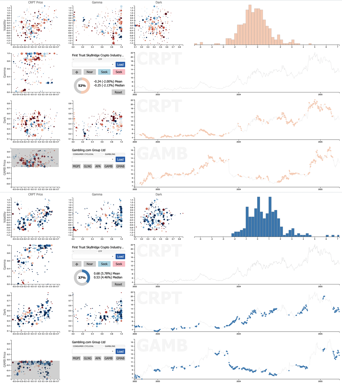
When Gambling.com (GAMB) is having a bad month, the crypto industry basket (CRPT) subsequently gets a boost. One form of gambling versus another, competing for our attention!
These things are all over the place, and they're tradable, but it may be that we cannot find them just by running regressions, or even building k-dimensional tree models. Like our discussion last week about SHOO, these are very human-textured themes that require a sort of empathy and understanding of what's going on under the surface, and the way people think and feel.
But we still want a list of them, because this is the stuff of great trades.
So how to we look for these little dramas in the market? How do we quantify things like this? And if we can't quantify them, how do we call our own attention to the ones that make the most sense, so we can evaluate them ourselves?
...
Is it time to ask a large language model for help?
Hmph.
Enjoy the week.
The SqueezeMetrics Team